We wanted to experiment with the fantastic Google Earth Engine tool, which allows easy access to petabytes of satellite imagery, current and historic. We were interested to access the data from the Copernicus Mission Sentinel 5P satellite platform (which was launched in 2017) with a view to using its atmospheric monitoring capability to visualise the impact of the COVID-19 lockdown on NO2 levels across the south of England. NO2 is a source pathway for particulate contamination and has several health impacts on respiratory tracts, as well as causing acid precipitation which damages plants and animals. With lockdown in full swing, the emissions of NO2 from cars and industrial sources has been greatly reduced.
Google Earth Engine provides a free-to-use ‘planetary-scale platform for Earth science data and analysis’. After registering for an account, we quickly received log-in credentials and access to the data. There are a wide range of tutorials developed by Google and by the community to get you going. One can build a fully fledged web app with it and there are several nice examples of how to do this.

We quickly realised there is an awful lot of data available. Some 480 data layers are presented for selection! From amongst these layers, we located the Copernicus Sentinel Imagery. The Sentinel satellites are maintained by the European Space Agency. There are a range of missions looking at marine, terrestrial and atmospheric applications. Sentinel 5P (https://earth.esa.int/web/guest/missions/esa-eo-missions/sentinel-5p) is used to measure Atmospheric levels of chemical compounds such as nitrogen dioxide.
We selected the COPERNICUS/S5P/NRTI/L3_NO2 layer – this provides the Sentinel-5P NRTI NO2: Near Real-Time Nitrogen Dioxide measurements. The filter date allows us to only retrieve those measurements taken during the preferred time window – in this case May 2020.
var collection = ee.ImageCollection('COPERNICUS/S5P/NRTI/L3_NO2')
.select('NO2_column_number_density')
.filterDate('2020-05-01', '2020-05-31');
Code is entered into an online GUI editor:

Code is developed in JavaScript so there is a familiarity for anyone who has experience with the Google Maps APIs and other web programming tools.
// define a 'collection' of images
var collection = ee.ImageCollection('COPERNICUS/S5P/NRTI/L3_NO2')
.select('NO2_column_number_density')
// .filterDate('2019-11-01', '2019-11-30');
// .filterDate('2019-12-01', '2019-12-31');
// .filterDate('2020-01-01', '2020-01-31');
// .filterDate('2020-02-01', '2020-02-29');
// .filterDate('2020-03-01', '2020-03-31');
// .filterDate('2020-04-01', '2020-04-30');
.filterDate('2020-05-01', '2020-05-31');
var no2Image = collection.mean(); // mean across each period
print('NO2 image', no2Image); // debug info in console
var band_viz = {
min: 0,
max: 0.0002,
opacity: 0.45,
palette: ['black', 'blue', 'purple', 'cyan', 'green', 'yellow', 'red']
};
// The region of interest - a planar rectangle around London/S.England.
var rect = ee.Geometry.Rectangle({
coords: [[-5.588271,50.755076], [1.305876,53.466477]],
geodesic: false
});
Map.setOptions('hybrid'); // set map to hybrid backdrop
Map.centerObject(rect, 7); // zoom in to the defined area
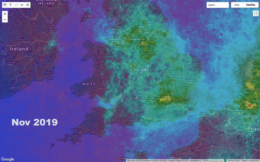
Map.addLayer(no2Image, band_viz, 'Sentinel 5P NRT N02 - Nov 2019');
// Create a task that you can launch from the Tasks tab.
// commented out here - but saves off geoTIFF files
//Export.image.toDrive({
// image: no2Image.clip(rect),
// description: 'NO2_image_export',
// folder: 'GEE',
// fileNamePrefix: 'NO2_change',
// region: rect,
// fileFormat: 'GEOTIFF',
// scale: 1000
//});
The code above builds up a set of all the available imagery for given time periods, and takes a ‘mean’ average of actual data values. Class values and appropriate palettes are used to show the data effectively. An opacity is set to allow the backdrop map to be seen. A rectangle is defined (in decimal degrees) for the south of England study area and a map is ‘zoomed’ to this area. The map has the ‘hybrid’ backdrop applied. The mean average image is then added to the map. We wanted to use custom labelling on the images (adding the month names), so the monthly average images were saved off separately to disk. Once saved, we could edit them and add labels to the images in Photoshop. We then used the online tool gifmaker (https://gifmaker.me) to merge all the files into one animated gif. The final result shows the changes in air quality experienced across the southern part of the UK before and during lockdown – showing how the air quality is beginning to pass back to the previous levels of nitrogen dioxide.
