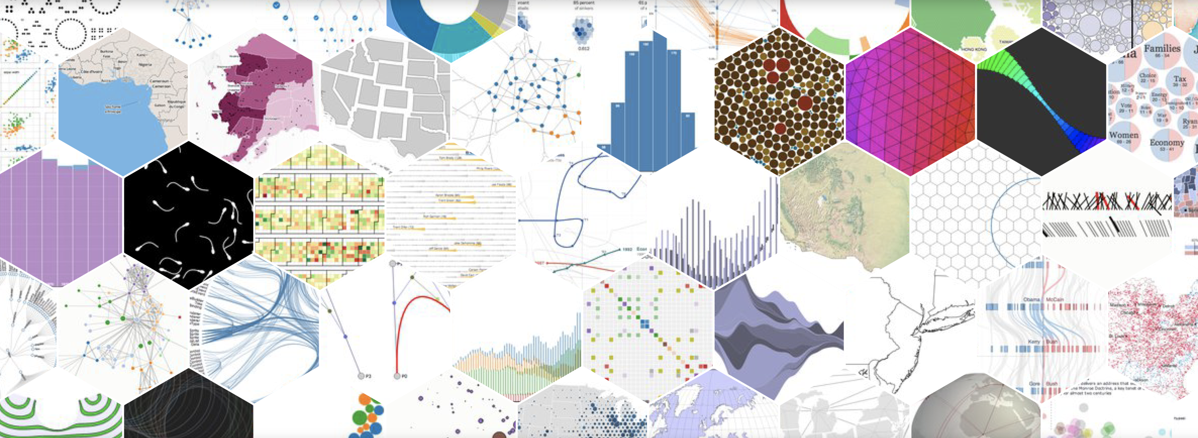
A key extension to undertaking data analysis is the effective communication of the subsequent results, helping interested parties understand clearly the analytical outcomes. The very act of visualising data can also itself play a key role in the interpretation and understanding of data. In this blog, we gather together and discuss a range of data visualisation tools – from specialist stand-alone software suites, to plug-ins for development languages and web-based environments. The tools and utilities listed here can form a useful resource for data science projects. We focus here on Open Source solutions.
First, here is a great glossary of data visualisation terms, https://observablehq.com/@a10k/data-visualization-glossary on the fantastic observable website
Stand-alone Tools
Listed here are software suites that offer dedicated capability for data visualisation.

Paraview
https://www.paraview.org
Paraview offers large scale data visualisation – the tool is described as being ‘.. an open-source, multi-platform data analysis and visualization application’. ParaView users can ‘quickly build visualizations to analyze their data using qualitative and quantitative techniques’.

Gephi
https://gephi.org
Gephi is an Open Graph Visualisation Platform, offering visualisation and exploration software for all kinds of graphs and networks. Gephi is open-source and free.

Bokeh
https://docs.bokeh.org/en/latest/
Bokeh is an interactive visualization library for modern web browsers. It provides elegant, concise construction of versatile graphics, and affords high-performance interactivity over large or streaming datasets. Bokeh can help anyone who would like to quickly and easily make interactive plots, dashboards, and data applications.
Web Tools
Many of the tools described in this blog have web components, or web capabilities. However, here we focus particularly on utilities and modules developed solely to enhance websites.

D3
https://d3js.org
D3 offers data driven documents, being a JavaScript library for manipulating documents based on data. D3 helps you bring data to life using HTML, SVG, and CSS.

Vega
https://vega.github.io/vega/
Vega is a visualization grammar, a declarative language for creating, saving, and sharing interactive visualization designs. With Vega, you can describe the visual appearance and interactive behavior of a visualization in a JSON format, and generate web-based views using Canvas or SVG.

Google Charts
https://developers.google.com/chart
Google Charts offers interactive charts & data tools that are powerful, simple to use, and free. A rich gallery of interactive charts and data tools is provided.

Google Maps
https://cloud.google.com/maps-platform/
The Google Maps Platform is a set of APIs and SDKs offering styling tools to create a custom map of any location.

ChartJS
https://www.chartjs.org
ChartJS offers simple yet flexible JavaScript charting for designers & developers.

Leaflet
https://leafletjs.com
Leaflet is an open-source JavaScript library
for developing mobile-friendly interactive maps.
Python libraries
There are a range of powerful data visualisation tools available for developing with Python, either standalone, or as part of a Jupyter Notebook environment or equivalent.

Matplotlib
https://matplotlib.org
Matplotlib is a comprehensive library for creating static, animated, and interactive visualizations in Python.

Seaborn
https://seaborn.pydata.org
Seaborn is a Python data visualization library based on matplotlib. It provides a high-level interface for drawing attractive and informative statistical graphics.

Plotly
https://plotly.com/python/
The Plotly Python graphing library makes interactive, publication-quality graphs. Examples of how to make line plots, scatter plots, area charts, bar charts, error bars, box plots, histograms, heatmaps, subplots, multiple-axes, polar charts, and bubble charts. Plotly.py is free and open source

Pygal
http://www.pygal.org/en/stable/Pygal produces a range of chart types and output types in python.
R libraries
There are also a range of powerful data visualisation tools available for developing with R, either standalone scripts, or within RStudio.

ggplot
https://ggplot2.tidyverse.org/index.html
ggplot2 is an extensible system for declaratively creating graphics, based on The Grammar of Graphics. You provide the data, tell ggplot2 how to map variables to aesthetics, what graphical primitives to use, and it takes care of the details.
Data Presentation tools
In addition to data analysis, data presentation is a critical task. Below are a few useful tools that can aid in the development of presentation of data and systems.

QGIS
https://www.qgis.org/en/site/
QGIS is the leading open source geographical information system (GIS), allowing you to create, edit, visualise, analyse and publish geospatial information on Windows, Mac, Linux, BSD and mobile devices.

Biorender
https://biorender.com
Biorender allows you to browse thousands of pre-made icons and templates from more than 30 fields of life sciences. Simple drag-and-drop functionality enables you to create scientific figures up to 50 times faster.
Do you know of other tools? Let us know below…
We hope this is a useful list of open source resources. We fully acknowledge this is not exhaustive, nor are the tools presented in any particular order, and nor do we particularly endorse any one title.
